Feature #21929
closed
Alternate process status summary display
Description
Based on feedback, a progress bar maybe isn't the best way to communicate succeeded/failed counts. This is proposal for an alternate rendering.
1. Render each item using the badge style as used to communicate individual process status:
(Completed: 10) (Running: 5) (Failed: 3) (Queued: 8) (Total: 26)
2. Clicking on a badge sets the filter to show just those items (clicking on Total shows all items).
3. Adjusting which badges are shown based on the query filter no longer makes sense. How can we indicate which badge corresponds to the current filter? A couple of ideas: some kind of extra emphasis, or changing the order so the currently selected one is first or last, maybe with a vertical bar that divides it from the others.
Adjusting the rendering should be straightforward as this is basically the format of the information being presented in the tooltip. Will need to add props for callbacks to change the data table filters.
Files
 Updated by Peter Amstutz over 1 year ago
- Target version changed from Future to Development 2024-08-28 sprint
Updated by Peter Amstutz over 1 year ago
- Has duplicate Feature #21911: Alternate progress bar rendering as separate badges with counts added
Updated by Peter Amstutz over 1 year ago
- Target version changed from Development 2024-08-28 sprint to Development 2024-09-11 sprint
Updated by Peter Amstutz over 1 year ago
- Target version changed from Development 2024-09-11 sprint to Development 2024-09-25 sprint
Updated by Peter Amstutz over 1 year ago
- Target version changed from Development 2024-09-25 sprint to Development 2024-10-09 sprint
Updated by Peter Amstutz over 1 year ago
- Target version changed from Development 2024-10-09 sprint to Development 2024-10-23 sprint
Updated by Peter Amstutz over 1 year ago
- Target version changed from Development 2024-10-23 sprint to Development 2024-11-06 sprint
Updated by Peter Amstutz over 1 year ago
- Target version changed from Development 2024-11-06 sprint to Development 2024-11-20
Updated by Peter Amstutz over 1 year ago
- Target version changed from Development 2024-11-20 to Development 2024-12-04
Updated by Peter Amstutz over 1 year ago
- Related to Feature #22296: Consider moving information from hover over in progres bar to static text added
Updated by Peter Amstutz over 1 year ago
- Related to Feature #22297: Make progress bar smaller added
 Updated by
Updated by Peter Amstutz over 1 year ago
- Target version changed from Development 2024-12-04 to Development 2025-01-29
Updated by Peter Amstutz about 1 year ago
- Target version changed from Development 2025-01-29 to Development 2025-02-12
Updated by Peter Amstutz about 1 year ago
- Target version changed from Development 2025-02-12 to Development 2025-02-26
Updated by Peter Amstutz about 1 year ago
- Target version changed from Development 2025-02-26 to Development 2025-03-19
Updated by Peter Amstutz about 1 year ago
- Target version changed from Development 2025-03-19 to Development 2025-04-02
Updated by Peter Amstutz about 1 year ago
- Target version changed from Development 2025-04-02 to Development 2025-04-16
 Updated by Lisa Knox 12 months ago
- File progressBadges.png progressBadges.png added
A brief gimp-up as a baseline for UI discussion

Updated by Lisa Knox 11 months ago
- File badgebarsquished.png badgebarsquished.png added
- File badgebarspaced.png badgebarspaced.png added
A couple of in-progress screenshots for UI feedback:
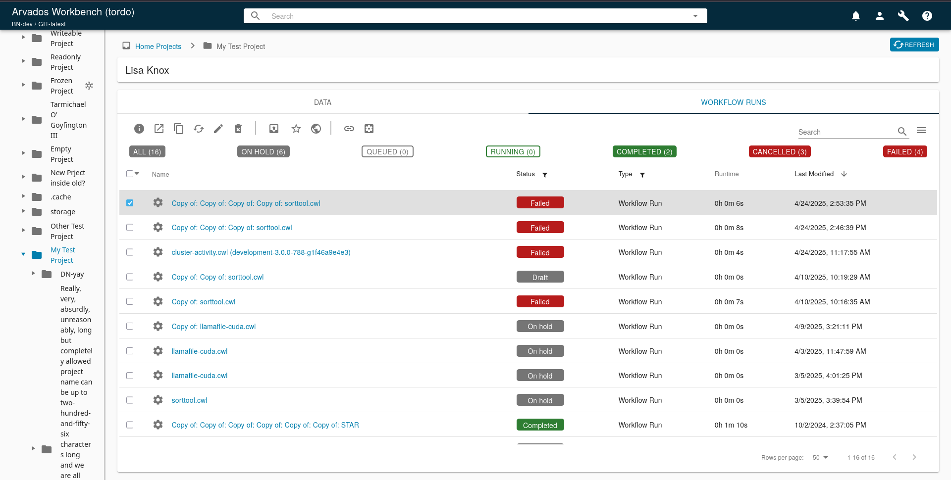
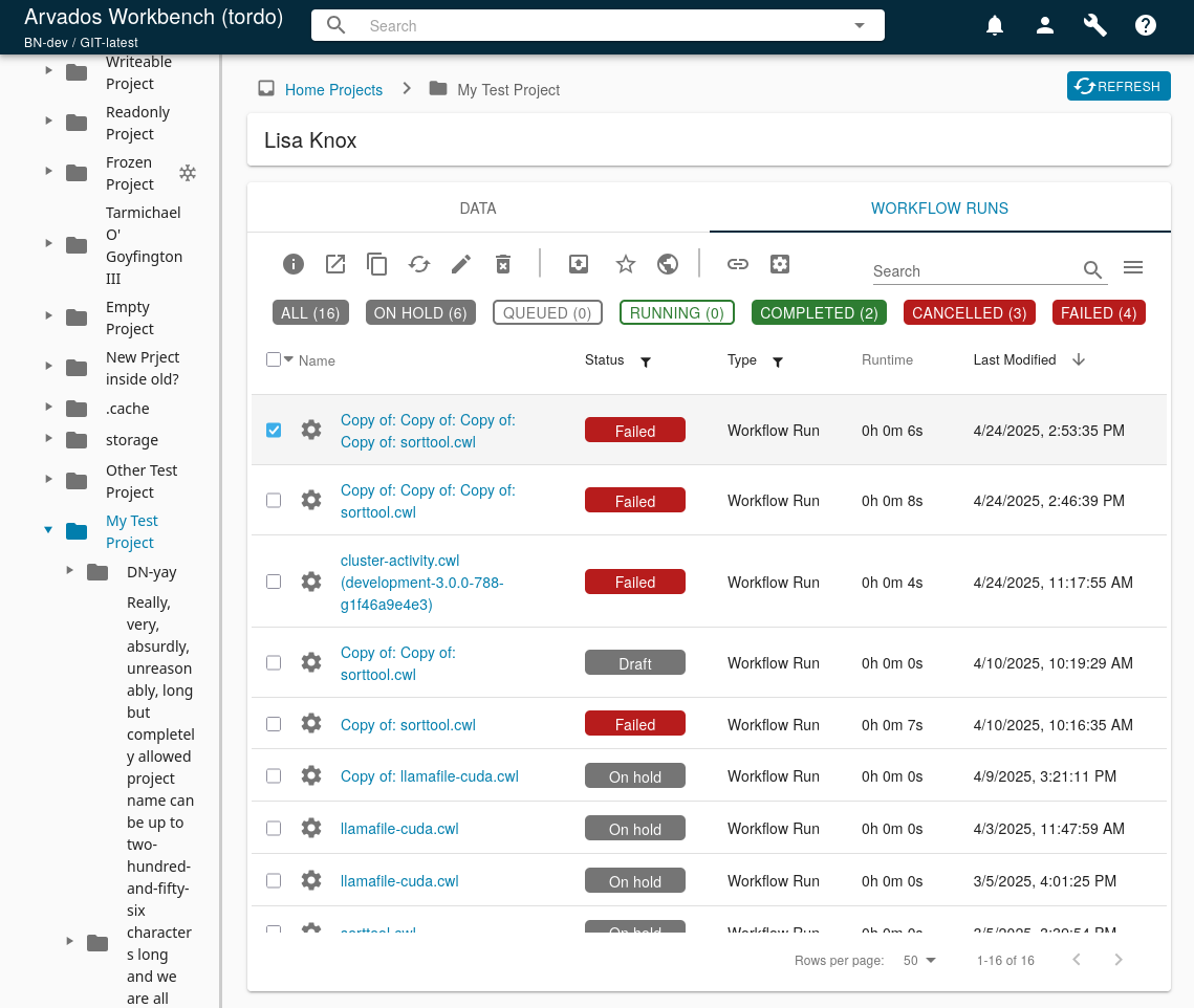
I think this should probably look much better, possibly a pseudo-tabbed look? I also need a way to make it clear to the user which filter is applied. I haven't yet determined how to adjust for data explorer widths < ~950px, when the button text starts to overflow, and I wanted to get this feedback before tackling that.
Updated by Lisa Knox 11 months ago
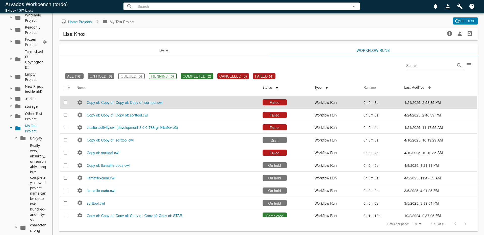
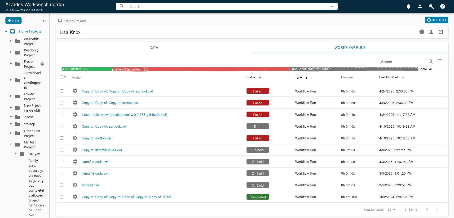
- File progressbar_alt2.png progressbar_alt2.png added
- File progressbar_alt1.png progressbar_alt1.png added
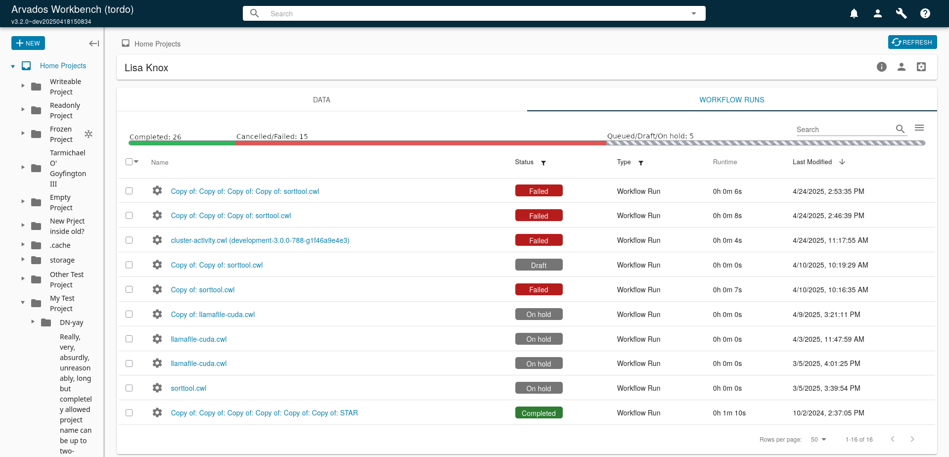
A couple more possible alternatives, based on the idea that the problem we're trying to solve here is that the old progress bar wasn't communicating information very well. Having buttons isn't actually necessary because they perform the same function as clicking the "status" filter in the table header. Displaying the total number of processes is also unnecessary because the text at the bottom "1-50 of 780" shows this information. In a view where we are constantly trying to find space to display all the information we need to display, displaying the same info twice should be avoided if possible.
My preference is for the second option, as it looks clean and elegant, while still displaying all of the information.
Updated by Peter Amstutz 11 months ago
The problems I was trying to solve with this ticket:
- Communicating information better -- if a segment in the progress bar is really skinny you can't see it. Also you need to know to mouse hover to get the tooltip with exact numbers, otherwise you can't tell if it represents 5 runs or 500.
- The most common operation from this table is to filter on status (to see what is currently running or drill down on failures) so I think it would be very convenient to be able to do that with one click instead of going through the filter menu (this is similar in spirit to splitting data/workflow tabs, it was something you could do already but it feels better with less clicking).
I agree that the second concept (text stacked on top of the bar) has potential.
Updated by Peter Amstutz 11 months ago
Lisa Knox wrote in #note-33:
justified left:
Based on the monday stand-up discussion, I think we're going to go ahead with this? Need to run it by Sarah.
Pending styling changes:
- Use lowercase for the button text
- "All" should go to the end, and be rendered in a neutral color (maybe the primary blue that's used for buttons)
- Pick a different color for "Cancelled" so as to distinguish it from "Failed" (probably an orange hue)