Idea #22793
closed
Design sketch to unify Projects/Collections/Processes/Workflow with tab-based design
Description
I'm looking for a mockup that takes each of these panels and converts them to tabs where the first tab is "Details" (the contents of the 1st card in each panel) followed by the other tabs.
Files
 Updated by Lisa Knox 11 months ago
22793-design-sketch @ 6e7ab350f31310e1a512986813a05735d67d372c
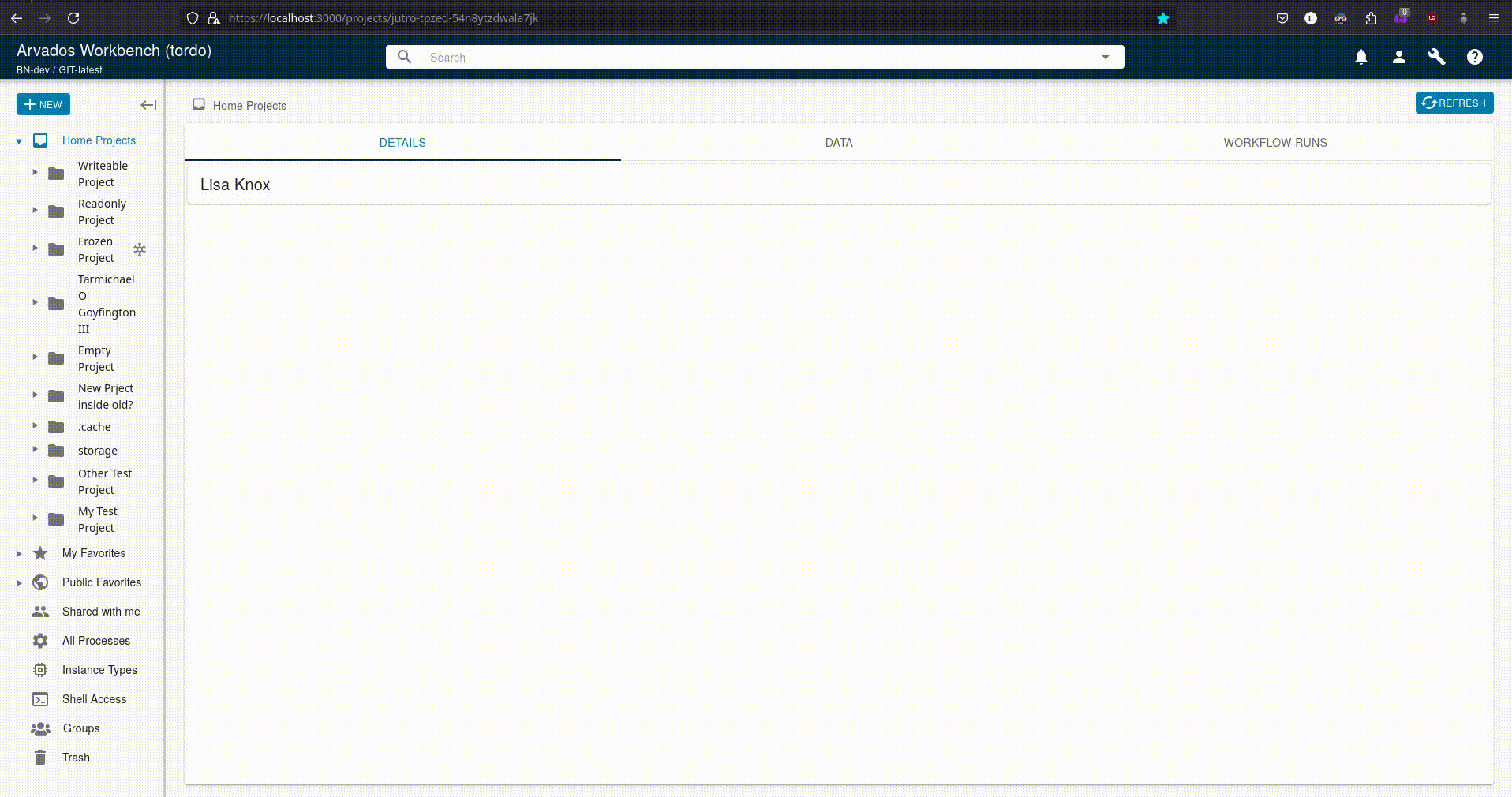
This is the rare case where a basic implementation of the suggested design was faster and more illustrative than mockups in gimp or excalidraw would be. The changes are in the project view (including "Home Projects"), the collection view, and the process view, and the workflow view. For projects, I just put the details card in a tab and set the description collapse to be always expanded. I think this works fine everywhere except the root project page, where I think the old design looks and works better. It may or may not be a good idea to make the root project view be different from any other project, but it's already unique in other ways so idk?
This is a very rough draft, and several style changes still need to happen:- Removing the drop-shadow around the
<Card />elements - Changing the layout of the project details card (putting tags at the bottom? centering the description on the page?
- Possibly adding dashboard-like page to the details tab of the Home Projects page, since there is currently nothing there
- Adjusting the spacing/number of tabs in the process view? The tabs get squished together around ~1000px
- replacing the three-dots button with the toolbar itself where appropriate
 Updated by Sarah Zaranek 11 months ago
I will put my thoughts my overall formatting thoughts and those that are specific to the page.
In general, I think this will be nice. Just the mock up looks pretty clear, and allows us to have additional space and build more functionality into each section.
*Overall
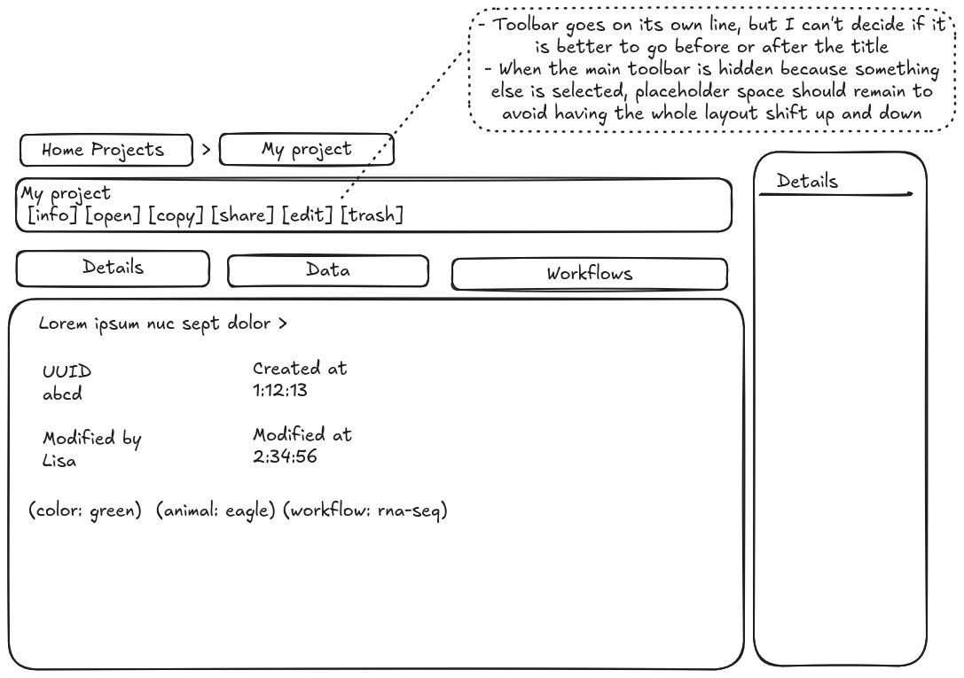
Location of Page Title, Description and Icons for Copy/Paste/Etc:
So, for the project page we don't have any details so that page would primarily be empty or even with a description relatively empty. We can "solve" this either by adjusting where/when the page title and assorted items are shown or expand out the details for the details panel. I will address my expansion ideas in project section. If we want to keep the details as is for the project page, I would recommend just not having a details panel and showing the top bar and icons across all the different tabs - similar to how it it done in projects now. And I would recommend doing it for all the other pages as well while adding a details panel. That way you can see the page title and access those icons/features across the sections and there would be unity across the pages and tabs. The question then is where to put the page description - I would say probably in the turn-down menu and then just have an option to open it and closed on default. It is also something we could put in the setting preferences that Stephen just built.
Tabs:
Can we explore the look of the tabs? Right now the default in Material UI doesn't look as "tabby" as one might want. Specifically, we could explore the following
(1) Changing the tab color to the cyan color that is for buttons and make the writing white. It should make it clearer that it something different and would follow the old color pattern for the navigation buttons we now have to move to different sections of the page. If we think the cyan color would be too confusing, we could explore either a dark blue to match the top bar.
(2) Explore having an icon under the button title - similar to the one used in the sections - then we wouldn't need to have it in the sections themselves
(3) Experiment with highlighting color so it clear which button is pushed? If we grey out text/button - this would be more obvious with the cyan background color
(4) The tab panel labels look so long, especially tabs within tabs - maybe adjust the labels to be just on the left? Or the line to be less dark?
Page Look:
(1) Now that we have more space on the page sections, can we up the default font especially in the main/details section?
(2) Can we explore not using grey for the labels on the details panel (I find it hard to read and parse) - and explore using chips or some other mechanism so we are not forced to give the information in columns.
(3) We are only really using 1 color (cyan) plus the black, grey and status colors so we probably could add a color if we wanted, for tabs, new utilities, font colors.
(4) On the topic of color, could we use a color besides grey for the chips that display the properties.
Properties:
We discussed this already but just so it is written down, make the properties able to have a default order and then make it possible to expand or constrict how many properties are shown with a ... or something similar to that.
(1) Don't show the properties label if there are no properties there - the hanging label is hard to parse. Either say none or don't show. Don't show to me would be the cleaner but I could see an argument for having None to show there are none and indicating to new users that properties exist.
Updated by Sarah Zaranek 11 months ago
*Project Page
If we want a details tab, then we should fill it out with the appropriate details otherwise, the opening page looks very empty.
Details:
(1) At first glance, you probably at minimum should add the UUID and Owner.
You could also add Last Updated and Created Time
(2) If we don't want a details tab, then I would just include those items in the info panel and then as suggested above, do the same "name bar" across all pages.
(3) I like the idea also that Lisa had to add more tableau-like, dashboard-like information about your project on that section. I will try to dig up some examples from other UIs that have something similar. We might think of this as a "stage 2" part of this tabs update but even if we do, we should make sure our intermediate solution is good enough, doesn't confuse anyone and isn't something people will miss when we add the dashboard-like tab.
(4) There is no icon for this type of page - as compared to the collection, workflow execution, workflow description pages. Perhaps somethin this one -- https://cdn.iconscout.com/icon/premium/png-256-thumb/multiple-folders-1180025.png
Updated by Sarah Zaranek 11 months ago
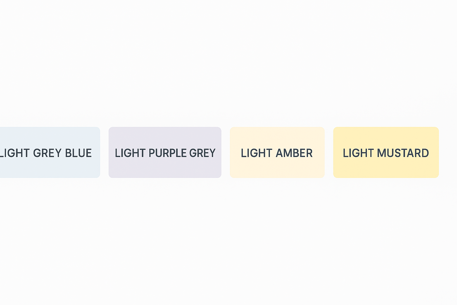
- File Chipcolors.png added
*Collection Page
General Stuff (not related to tabs but now that in a tab we might want to make improvements on the page info, look)
In Details:
(1) Link to process is not in the info panel.
(2) Link to process is a confusing term. Other options might include -
Origin Process, Show Origin Process, Trace Back to Workflow, Trace Back to Process, View Generation Details, Generation Process, Generation Details...
(3) Explore the option to copy everything that is listed not just UUID,Owner and PDH
(4) Ideally make this have the most important information and have it not just the API information verbatim. For instance, you could give number and files and the size in the same line, or just have (head) next to the versions to indicate the "head" collection
(5) Since we have more space could we have an edit button on the details panel and not just the drop down? Not sure where it would be or if it would be overwhelming but it might be nice to be able to edit in place w/o have to go to the info panel.
(6) I tried to put a larger description in using the edit button and it said my description was limited to string length of 255, which I found odd since I know people have larger descriptions but maybe it is different for projects vs collections OR maybe just via WB2?
(7) Description is not indented as it is in the Project description. For all pages, we should make the description act the same way if possible.
Files:
(1) I think this is coming, but have the same options we have under projects to move, delete files by icon not just by going into the ... menu.
Updated by Sarah Zaranek 11 months ago
- File Chipcolors.png Chipcolors.png added
Possible Chip Colors
Updated by Sarah Zaranek 11 months ago
*Workflow Description
Again mostly not due to the tabs but general things that will be showcased when we move each section into their own tab.
General:
I find this page always confusing, perhaps because it looks so much like a run workflow except it isn't so when you look at it at first it isn't clear what it is.
Details:
(1) No descriptions says - (no description) - but that is not the case with the Collection page.
(2) Description is tabbed over to be inline with the above text (not aligned with icon) but for the project page it is indented with respected to the above text.
(3) Assume will have similar icons as in Project setup to copy etc.
(4) Explore different formatting, see collection page notes for examples.
(5) I have always found the location of the run button to be strange. I think we are trying to have it look similar to the status button but different. But I find it to be "hidden" in the right hand side (especially in the info panel) - and unlike all other buttons it is green and not blue which I guess is OK since it is for run - but go against the general format. Also, do we need workflow there? Just run?
(6) Properties description is shown w/o properties
(7) No Edit option available - is this because of how these are stored or is it there another reason?
Run History:
(1) Looks so much time sub-processes, I am always confused, not sure how to help, perhaps at least a different icon or slightly different visual?
(2) I find it odd we don't have information about who/where the workflow was run. If I was trying to determine which ones were mine, I would find it difficult especially since if a few people are running the same workflow using defaults they probably all have a very similar name. Can we add some of this information to the table?
Output Parameters:
(1) Since this is a template not a run workflow, I find it odd to show an empty collection and no default value. I think what happened is that we want to reuse the output parameters from the workflow execution page - but it would help the overall look of the page and help with the confusion between the workflow template and execution pages to not have it be the same.
(2) Also, I still end up with a huge white page after the outputs are listed, this probably will not be a problem with tab, put if we do end up putting a bottom/outline with the tabs then we should avoid this extra space.
(3) In this use, we only have 1 tab - the parameters tab, so I think you should not have a tab (which will ultimately will be a tab w/in a tab when we shift sections to tabs)
Input Parameters:
(1) See Output Parameters above for formatting concerns.
(2) This applies to both Input and Ouput but I see it more in Input so putting it here. The secondary files are listed but just tabbed over a little. It is a little confusion knowing what is happening with that. I am not sure what a better option is - a label would probably be cumbersome. Just pointing it out as something to think about.
Workflow Definition:
(1) BUG: I think the workflow template was made before we updated how we showed the CWL so it just stalls out for me in this section --> https://workbench.pirca.arvadosapi.com/workflows/pirca-7fd4e-jxf0ot5veecu3lf. Is this a known bug?
(2) Using the public one that works - I think this is fine but it is a little confusing what original is - or what helper is.. It would be ideal if we could have a tab that displays the workflow diagram here or shows the CWL itself with text highlighting - but I guess being able to click and view it in my browser as a file is useful.
Updated by Sarah Zaranek 11 months ago
- Executed Workflow
Details:
See above sections regarding formatting of the details section, format of the description, appearance of the properties, etc.
(1) The warning messages/error messages always look a bit awkward in size and location. We should take another look how they will appear in the tabbed format and see if we can get a better look and feel to them
(2) The status button feels very far over - I am not sure where to put it but it looks a little awkward
Outputs/Inputs:
(1) See formatting issues described in Workflow Description Above
(2) I didn't notice before but the labels for the columns are different colors for input/outputs vs sub-processes. We should double check this across each section but I prefer the color that is different than the text in the columns to be able to tell what is a label and what is data
Log:
(1) I remember that we were going to run the report for crunch stats automatically at the end of the execution but I don't see it in my logs. Maybe I am looking at an old run. If that does exist and is in a collection it would be nice to link it somewhere.
Command:
(1) Would be nice to be able to cut and paste command, I guess. I am torn since this command is usually so different than what I use to actually run the workflow. I am wondering if there is a way to make it more useful.
Resources:
(1) This section looks awkward due the formatting. It would be nice to clean it up so it looks better.
 Updated by Peter Amstutz 11 months ago
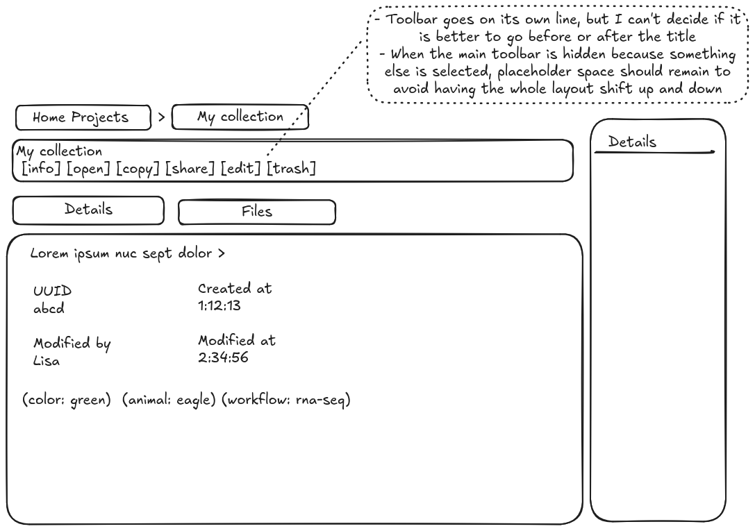
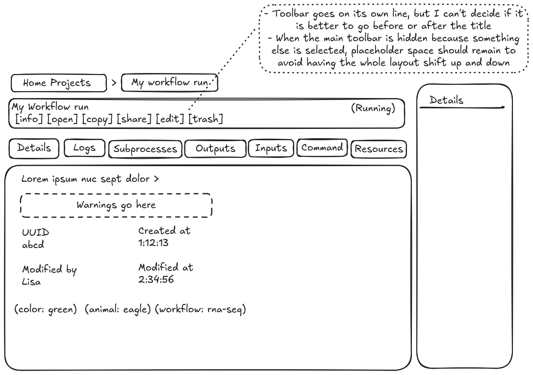
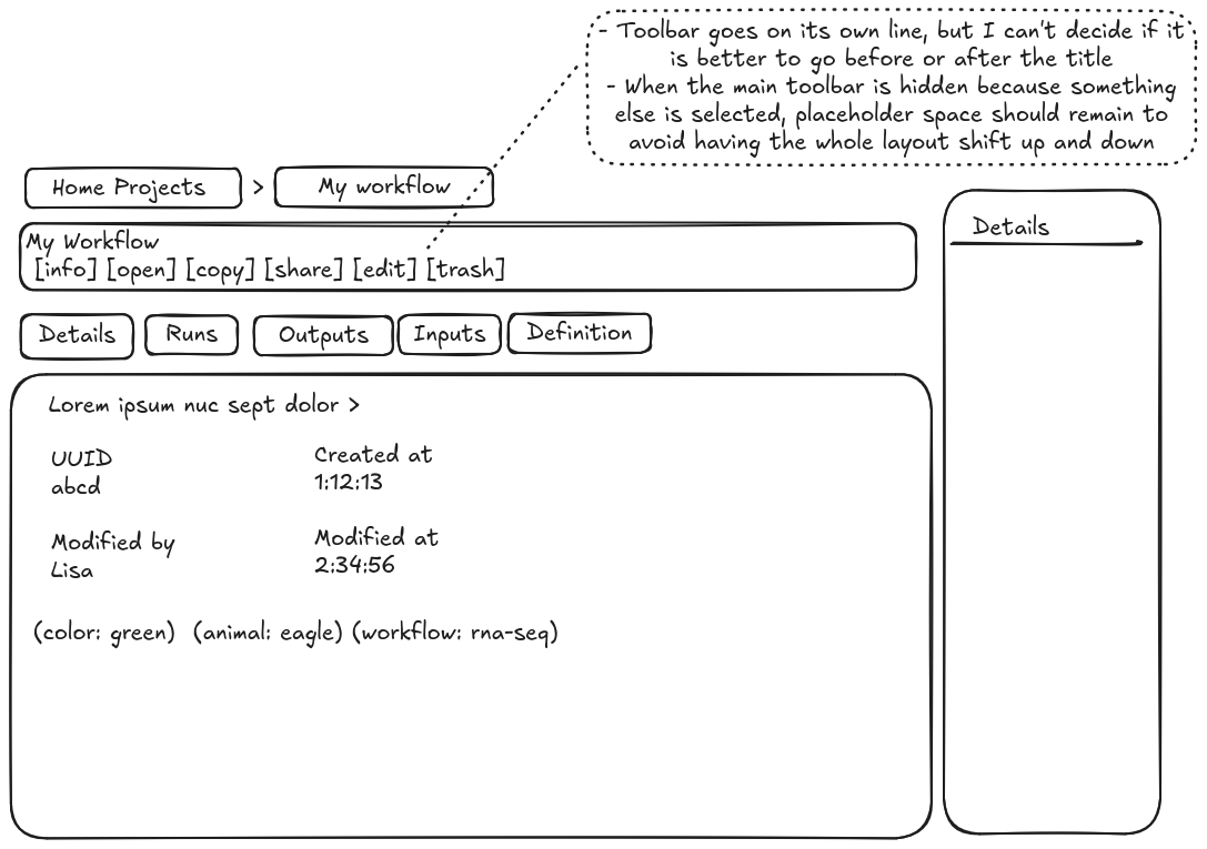
- File collection-details-layout.png collection-details-layout.png added
- File project-details-layout.png project-details-layout.png added
- File process-details-layout.png process-details-layout.png added
Updated by Peter Amstutz 11 months ago
Updated by Peter Amstutz 11 months ago
A couple notes:
- Currently we have an extra special "Cancel" button on running workflows. I don't think we need this any more, because we'll have a "Cancel" button on the toolbar that does the same thing. The only difference is that it won't be big and bright red, so it will be less obvious, so we do need to decide if how we feel about this change.
- Workflow definition have the same problem with the big green "Run workflow" button. There will be a "run workflow" button on the toolbar that does the same thing, but it won't be big and green.
Updated by Peter Amstutz 10 months ago
- Precedes Bug #22464: Workbench screenshots in user guide are noticeably out-of-date added
 Updated by Brett Smith 10 months ago
Thoughts on dealing with long descriptions. There's a tension between:
- If you're looking at an unfamiliar thing, the description is probably the very first thing you want to see. It wants to be prominent.
- If you're already familiar with the thing, you probably don't need the description and you want it to stay out of the way so you can get on with your work.
My personal suggestion: At the top of the tab, display "a few" lines of the description. If there's more, display a "Read more" button that expands to show the full description. This keeps the description prominent for the first case; doesn't take up undue space for the second; it automatically does the right thing if there's an empty/short description; and the "Read more" functionality is familiar from other web apps.
Updated by Peter Amstutz 10 months ago
Brett Smith wrote in #note-23:
Thoughts on dealing with long descriptions. There's a tension between:
- If you're looking at an unfamiliar thing, the description is probably the very first thing you want to see. It wants to be prominent.
- If you're already familiar with the thing, you probably don't need the description and you want it to stay out of the way so you can get on with your work.
My personal suggestion: At the top of the tab, display "a few" lines of the description. If there's more, display a "Read more" button that expands to show the full description. This keeps the description prominent for the first case; doesn't take up undue space for the second; it automatically does the right thing if there's an empty/short description; and the "Read more" functionality is familiar from other web apps.
This is basically the "turnout" idea, except the design sketches have a single line and I think we probably want to show a max-height that shows the top 6-8 lines and then have a turnout to show the entire thing.
Updated by Lisa Knox 9 months ago
22793-unify-tab-view @ 2036cc7d9d0e990ee4d9434d6d97a19fbbb515e6
developer-run-tests-services-workbench2: #1534
- ✅ All agreed upon points are implemented / addressed.
- It was decided in discussion that this ticket should focus only on converting the Process, Collection, and Workflow panels to use the same tabbed view that the Project panel uses. The rest of the styling described in the notes should be implemented on a later ticket.
- ✅ Anything not implemented (discovered or discussed during work) has a follow-up story.
- ✅ Code is tested and passing, both automated and manual, what manual testing was done is described
- ✅ New or changed UX/UX and has gotten feedback from stakeholders.
- ✅ Documentation has been updated.
- ✅ Behaves appropriately at the intended scale (describe intended scale).
- ✅ Considered backwards and forwards compatibility issues between client and server.
- ✅ Follows our coding standards and GUI style guidelines.
Updated by Brett Smith 9 months ago
- Target version changed from Development 2025-06-25 to Development 2025-07-09
 Updated by Stephen Smith 9 months ago
- 1 line descriptions shrink instead of expanding when clicking expand
- The command tab scrolls contents when more space is available (it should probably just use all available vertical space and scroll when necessary - I think you can just height: 100% the parent container that is currently max-height 50%, but it's a virtual list so there might be caveats)
- Unused button styles in multi-panel-view.tsx:L47, empty selectedTab class
- warningLabel in collection-panel.tsx:L48 is unused
Updated by Lisa Knox 9 months ago
22793-unify-tab-view @ 6a889813a7af30e9b68c38ccdfe03780fe87d663
developer-run-tests-services-workbench2: #1540
All points addressed, plus a merge with main to check for conflicts
Updated by Lisa Knox 9 months ago
- Status changed from In Progress to Resolved
Applied in changeset arvados|cfc2a164139143dd921b7e665ce5faf30b5641f2.
Updated by Brett Smith 8 months ago
- Related to Bug #23063: Process overview should filter out cwl_input and cwl_output properties added