Feature #23390
closed
Integrate description into title pane; change default tabs
Description
Background
In #22793 we gave most Workbench pages a tab-based view for consistency, including collections, processes, and workflows. These all default to the Overview tab. We've started getting feedback that users don't like being forced to go through the extra click (e.g., to the Files or Workflow Runs tab) for common navigation.
At the same time, in the past we got feedback that users want descriptions to be more prominent. e.g., this was a motivation for #22075.
We want to find a solution that makes common navigation quicker without putting an extended description out of the way for users who want it.
Proposal
At a high level, the idea is:- Move the Description out of the Overview tab and into the title pane, underneath the item name and action toolbar.
- Change the "default" tab on page open to the most common tab for that kind of resource.
Details:
- Remove the Description from the Overview tab completely.
- Extend the title pane so the Description appears below the current item name and action toolbar.
- We should render at least three full lines of description.
- It's nice how slick the current title pane is and we don't want to give that up completely.
- Therefore do not add any kind of "Description" header or divider. Just render the text right there in place.
- We can calculate the height of two lines based on the current font size and use that. We do not need to account for content of different sizes, partly because we're using CSS to mitigate that. See below.
- If the description doesn't fully render in preview, then it fades into a "Read Full Description…" link. Clicking this link opens a popup that takes almost all the available space to render the full description, similarly to the way the "first login" functionality works now.
- I considered having the Description expand in place, but then having the title pane grow to take most of the page felt awkward, and I thought navigating the page afterwards would be confusing.
- We have gotten feedback that the current chevron › to expand the description is not obviously interactive. I think a "Read More" link is more familiar to more users from other sites, especially since this plan does away with any explicit "Description" header.
- This description preview should use specialized CSS to account for the limited space. In particular, headers should be rendered in bold, followed by an em dash, then the text of the following block. Paragraphs and other text blocks do not need blank lines between them; they just need to each be on their own line. Images handling per branch.
- Note that this means if the description is short, it just appears inline under the name. This seems like a nice affordance too.
- We should render at least three full lines of description.
- Change the default tab that is open when you open a new resource page:
- Projects are unchanged. Keep the current logic to follow user preferences.
- Collections default to the Files tab.
- Workflows default to the Workflow Runs tab.
- Processes keep the current default of the Overview page. There is not an obviously better default, and the Overview page for Processes is more useful than other Resource types, so it stays the default.
- Do not change the tab layout. The first tab for every resource type is still Overview. We're just changing which tab is open first.
- In the future, it might be a nice usability improvement if open tabs with empty contents suggested an action to fix that. E.g., an empty Files tab offered a button to upload files, or an empty Workflow Runs tab offered a button to run the workflow. But that can be a separate follow-up ticket.
Files
 Updated by Stephen Smith 3 months ago
Here's a few snippets I came up with earlier that may be helpful:
h1-6, p {
display: inline
}
// Add line breaks at the beginning of all headers and paragraphs following other paragraphs
p + h1::before, p + p::before {
  content: "";
  display: block;
}
// No-op any linebreaks
br {display: none}
 Updated by Brett Smith 2 months ago
Stephen Smith wrote in #note-1:
Here's a few snippets I came up with earlier that may be helpful:
This might not cover every corner case but I think the baseline of what we want for spacing is a line break at the end of every p tag, and that's it. Headers etc. get rendered inline. This way if you have a layout like:
h1: Project Name
h2: Introduction
p: Lorem ipsum dolor sic amet…
h2: Details
p: The quick brown fox…
Then it renders as:
Project Name — Introduction — Lorem ipsum dolor sic amet…
Details — The quick brown fox…
This feels like a good balance of preserving structure within the limited space. It feels pretty followable to me.
I think we want to preserve br tags. If the user manually wrote a break it's probably structurally important.
Updated by Brett Smith 2 months ago
- Related to Bug #23343: Description in Workflow view does not adjust to the content and is not expandable or scrollable added
Updated by Brett Smith 2 months ago
- Related to Idea #22713: Better visibility for descriptions -- descriptions open on first navigation and are more visible in details added
Updated by Brett Smith 2 months ago
- Related to Feature #23320: Ability to set the Files tab as default in Collections view added
Updated by Brett Smith 2 months ago
- Target version changed from Development 2026-01-21 to Development 2026-02-04
Updated by Brett Smith about 2 months ago
Discussed at standup:
- Replacing images with alt text seems to require JavaScript HTML parsing. We'll just omit them for v1, this can be revisited later if needed.
- Rendering "Read More" at the end of the line is inordinate work. It can just appear on the following line.
Updated by Stephen Smith about 2 months ago
· Edited
Changes at arvados|3d15ef476e5aae7214076e7c0a6784a232220228 branch 23390-description-preview
Implementation notes:- Read more shows whenever the content is taller than ~2.9 lines (the extra limit is needed to fit in the read more text, and for regular lines it should either fit fully or trigger the overflow)
- I managed to make images go on their own line (prevents text from being pushed out of sight by images on the first line)
- Added a similar fade-out as the current collapsible description, which is attached to the read more link
- The full description popup is a little bigger than the banner and more responsive
- I still need to make the default tab changes
- Also still need to remove the regular description
Updated by Brett Smith about 2 months ago
Great v1. For being a completely new rendering this feels very mature. I tried throwing a few descriptions at it and I was happy with how they all rendered in the preview. Thanks.
- On my browser the second line fades out. See below. The fade effect is nice and I'm inclined to keep it but I do think showing two full lines of description is the bare minimum to be useful. Beyond that, I'll admit I keep going back and forth in my head about how much description we should preview. I don't think there's one single answer that fits all and I don't have a strong intuition of what a good sweet spot would be.
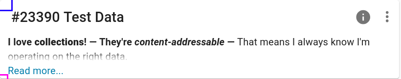
Right now I want to say: let's do three full lines, and have the fourth fade out into "Read more." Is that a reasonable change? If it would be more work than I think, or if you or anyone else has your own opinions about how much description is useful, please flag that, I'm very open to discussion on this. - Can we please have description use the same horizontal+vertical margins as the title? e.g., make the purple lines here match the blue lines:
- Sorry for changing my mind on this but could we change "Read more…" to "Read full description…"? I think that would be even clearer about what you're getting with less reliance on context.
- Maybe you just haven't gotten to this part but when I said description should "move out" of the Overview tab that means it should not appear under there at all any more, since now it's redundant with the title pane view. Just flagging that needs to be in the final branch.
Updated by Brett Smith about 2 months ago
- Description updated (diff)
Stephen says the feedback is doable. Updated the description to reflect changes.
Updated by Stephen Smith about 2 months ago
Changes at arvados|7609d42f5c70e7e0291224e2d6f4df482e883611 branch 23390-description-preview
Tests developer-run-tests-services-workbench2: #1680
- All agreed upon points are implemented / addressed. Describe changes from pre-implementation design.
- Added 4 line preview to title pane of the 4 resources, "read full descriptions" shows beyond 4 lines
- Due to how the CSS works, 5 lines still shows the read more button instead of just showing the 5th line, but at least it remains accessible in the pop up
- Preview area is styled with inline/bold headers and em dashes, images are placed on their own line, and line breaks added after each paragraph
- Corrected some type oversights with descriptions being nullable
- The full description pop up is a little wider than the banner, and uses more default material styles to be responsive
- Removed original description area for the 4 resources
- Changed default tab of collections and workflows to the main content tab
- Added 4 line preview to title pane of the 4 resources, "read full descriptions" shows beyond 4 lines
- Anything not implemented (discovered or discussed during work) has a follow-up story.
- none
- Code is tested and passing, both automated and manual, what manual testing was done is described.
- Passed manual tests, updated cypress tests where needed
- The tested code incorporates recent main branch changes.
- Within a week, but no conflicts are expected
- New or changed UI/UX has gotten feedback from stakeholders.
- Yes
- Documentation has been updated.
- n/a
- Behaves appropriately at the intended scale (describe intended scale).
- no change
- Considered backwards and forwards compatibility issues between client and server.
- none anticipated
- Follows our coding standards and GUI style guidelines.
- yes
Updated by Brett Smith about 2 months ago
Stephen Smith wrote in #note-15:
Changes at arvados|7609d42f5c70e7e0291224e2d6f4df482e883611 branch 23390-description-preview
I took another look and I'm happy with the UI of this. Thanks! I'm looking forward to this.
Updated by Brett Smith about 2 months ago
Going over the requirements again, I thought about another functionality change I'd like to make. I think this is basically independent from other work in the branch. It could be a separate ticket. I'll spell it out, and let me know how you'd like to organize this, and we'll make that happen.
I'd like to amend this point:
- Projects are unchanged. Keep the current logic to follow user preferences.
And I don't want a dramatic change: if the user has a preference set, I still want to follow it. However, if the user has no preference set, I think we should default to the Data tab. It is more likely to be useful than the Overview tab.
Any idea how big a change that is? (I'm guessing it's a small change to the code, and then a bunch of annoying mechanical changes to tests, unfortunately.)
 Updated by Lisa Knox about 2 months ago
- The full desciption display needs more padding at the top.
- In keeping with existing Workbench patterns,
descriptionDialogActionsshould be a named export of src/store/description-dialog instead of the default export. - The only change in 5d47fbe8bb4e038d1ae29ebc4f386ba94b0ecaf3 is an extra trailing newline. I laughed when I saw the commit message, but there is no reason to keep this commit except that it's more work to remove it.
The minor notes aren't necessary to fix before merging imo, just flagging them so you can fix them if it's convenient to do so.
Updated by Stephen Smith about 2 months ago
Changes at arvados|9da596764eb5f7dc678501a2f088490a64dd7f00
Tests developer-run-tests-services-workbench2: #1681
- Changed fallback project tab default to Data
- Also fixed an error where the tab key was used to set the fallback default tab instead of the value, it probably wasn't noticed because if no default tab is set, it uses the first tab which was the previous intention
- Added some padding to the top of the description dialog
- Normalized named export usage for actions (and also in the banner which is what I copied)
- The whitespace commit actually has 14 whitespace changes - when saving a file removes more than a couple pieces of trailing whitespace, I like to make that a separate commit so it doesn't make it harder to see the actual changes
Updated by Stephen Smith about 2 months ago
- Status changed from In Progress to Resolved
Applied in changeset arvados|d7c7bccfbacc53ce9a088733ec2bace715ca8067.